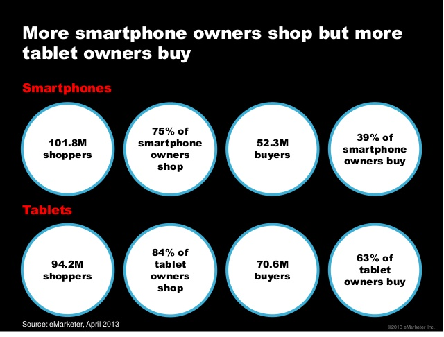
Tablet viewers have a greater propensity for Video Content viewing and have greater Video Completion Rates. According to eMarketer the average time spent per day by US Adults for non voice activities is approximately the same for Smartphone and Tablets. According to a Mobile Usage Study 90 % of Mobile users share on social networks and Tablet users have a greater propensity to buy.
Optimizing Video Creative for mobile devices has become imperative as Video requires a new creative approach and ad monitoring
How do you optimize Tablet Experience for your Brand?
Mobify has shared handy tips that can optimize the Tablet Experience with Design Elements.
Things like touch enabled interface elements, larger buttons, and smart input forms transform a user’s tablet experience. What’s more, many of these enhancements can be made using a responsive design approach – using basic media queries to adjust your site’s CSS.
Make Touch Targets big
To help your users achieve tiptop tapping accuracy, increase the spacing between
different touch targets. And don’t forget to make them big! Research shows that
human fingertips typically require upwards of 44px to comfortably fit within a
touch target.
Minimize Tablet typing
Using a software keyboard is not nearly as easy or as fast as using a physical
keyboard, no matter what orientation or physical position a tablet is in.
Since it’s more difficult to input data on a software keyboard, try to minimize the
number of typing tasks required on your website.
Enable contextual keyboards
Software keyboards have one main advantage over their physical counterparts: they
are dynamic. In other words, software keyboards can change their layout based on
the context of the requested data.
For example, if your input field requires an email address, you should make sure the
keyboard features the ‘@’ symbol, underscores and hyphens. If the field requires a
phone number, offer up a numeric keypad.
Turn off auto correct and auto-capitalize on form fields
Smartphone and tablet operating systems have slightly more aggressive auto correct systems than their desktop counterparts. This has been designed to combat the combination of clumsy fingers and keyboards that give no tactile feedback, both of which typically result in a higher rate of user error.
Increase the default font size and line height
Rather than requiring users to double tap your content, make sure the font size is at least 16px and above for maximum comfort on the ol’ peepers. You can also use a
line height of 1.5, although this can be set tighter or looser depending on the context.
The idea is to size your text so that it is always legible, no matter how a user is
holding their device.
The best icons are font based
Tablet screens typically have resolutions and pixel densities far beyond most
desktop monitors and laptop displays. The result is graphics that look fuzzy or blurry
if they’re not designed for such beautiful screens. Font based icons offer a number of
benefits for tablet web design: they scale extremely well on super high resolution
displays, they’re easy to colour and shade using CSS, they only require one HTTP
request to download, and you can avoid the hassle of dealing with a sprite sheet.
Tablet screens are gorgeous
So make sure you serve up images that look amazing on high DPI screens! Extremely high-resolution images are a great way to surprise and delight your users (because most images on the web look fuzzy, pixellated or even blurry when viewed on a Retina quality screen).
If you have impactful images on your website, make sure you give them lots of space over trying to cram too many elements into the viewport. Users respond extremely well to high quality images – larger product images can increase conversions by as much as 9% –
so give them as much room as possible.
Make content fluid
Flexible grids continue to provide the best way to ensure your content looks great
across different tablet screens in different orientations.
Stick to regular tablet media queries to render your design, but instead of declaring
fixed width elements inside of the body, use percentage based widths so that your
content stretches appropriately on differently sized devices.
Create totally tabletized navigation
Rather than simply forcing existing site navigation into a new layout, try to make it as simple and as compelling as possible for tablet users. This might mean throwing away what you have and starting again!
Make actions easier
Take advantage of common touch ‘hot zones’ by making actions easier to reach.
Place key interactions like menus, add to cart and purchase buttons in these easily
accessible areas.
Give images their 1000 words
Images are incredibly powerful. They have a huge effect on conversion rates
and user engagement across the board.
Source: eMarketer, Unruly Social Video Report Q1 2013 and Mobify
Video Courtesy of Adgent
 Solomozone